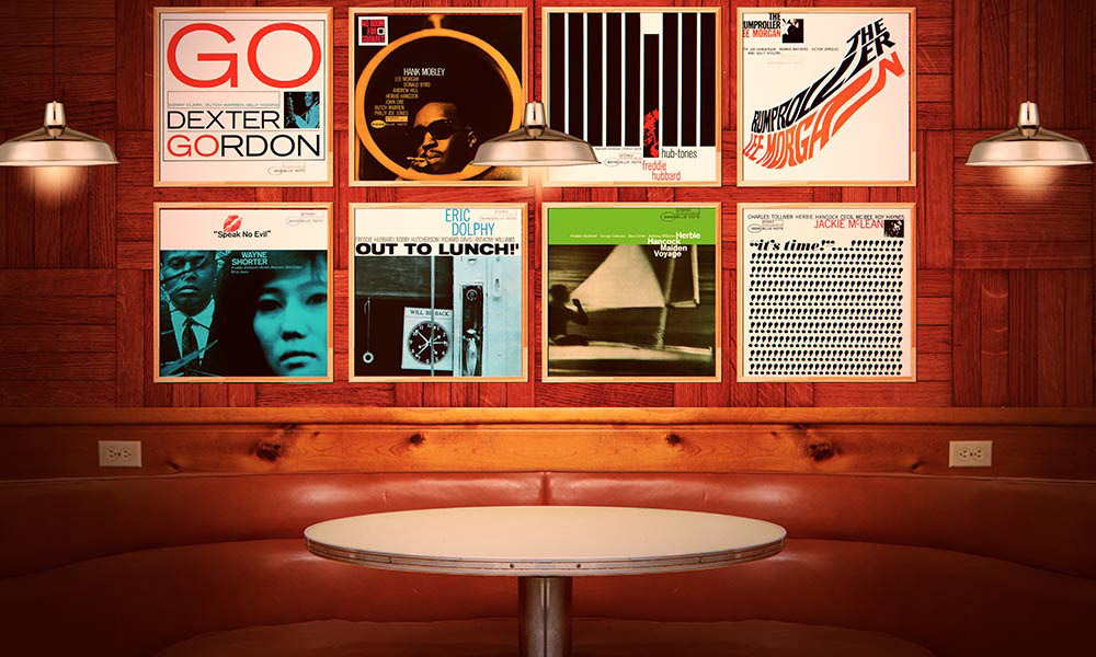
When it came to jazz album covers, Blue Note was unequivocally the market leader in the 50s and 60s. In its dedication to excellence in every aspect of record-making, the label’s packaging – consisting of an enticing front cover picture and obligatory sleevenotes on the back – undoubtedly matched the high quality of its music. While Blue Note’s co-founder Francis Wolff provided the photographs of the label’s musicians, it was Reid Miles, who joined the company in 1955, who came up with the eye-grabbing designs that now cause debate among fans over the best Blue Note album covers.
Miles stayed with the label until 1967. During his 11 years with Blue Note he produced an array of different designs that were frequently characterised by a striking juxtaposition of bold typography – often including exclamation marks – with tinted photographs that were sometimes cropped in an extreme way. Wolff was apparently dismayed at this, feeling that his work was being violated by the young designer. Miles’ designs, however, gave Blue Note’s covers an avant-garde edge that made them stand out in the record-store racks. More importantly, they helped to change the way that jazz was marketed and presented, and, crucially, also altered how African-American musicians were perceived.
Given how many wonderful artworks Miles produced in the 50s and 60s, choosing just 20 of the best Blue Note album covers is a difficult task. Ultimately, it all comes down to personal taste, and the following 20 artworks (not listed in order of merit) don’t represent a definitive list but rather reflect a subjective appraisal of their worth.
If you disagree with some of the choices, you can use the comments section to tell us your contenders for the best Blue Note album covers. What can’t be disputed, however, is the superlative quality of Miles’ and Wolff’s work, which helped the humble album cover to transcend its functionality and be considered a work of art in its own right.
Listen to the Blue Note: The Finest In Jazz Since 1939 playlist right now.
Dexter Gordon: Go (1962)
Never using many hues, Reid Miles often exploited the contrast between black and white in his designs, but here he uses orange and blue to add drama and emphasis to one of the best Blue Note album covers – and one of the first that many Blue Note fans think of. There’s a small blue-tinted picture of Gordon neatly boxed in a rectangular framework that is simple but tremendously effective. This is art as a statement of intent.
Donald Byrd: A New Perspective (1963)
This is one of the few Reid Miles covers where the photo (also taken by the designer) plays a bigger role than the graphic design. Byrd is dwarfed by his E-Type Jaguar, whose headlight is a prominent feature of a photo that is taken from an unusual angle and offers a visual metaphor that sums up the album’s title.
Eric Dolphy: Out To Lunch! (1964)
One of Blue Note’s most iconic covers shows how Miles can take a mundane, everyday photo (a cropped snap of a shop door) and, by dint of a subtle blue tint and framing it with bold typography, transform it into a memorable image. Saxophonist Dolphy was dead by the time Out To Lunch! came out, a fact that lends the “will be back” sign a poignant irony.
Hank Mobley: No Room For Squares (1964)
Reid Miles was fond of visual puns and here, in a bid to prove that a cool-looking Mobley – wearing shades and drawing on a cigarette – is no square, the designer encircles his face. Rather than an effect added after the photo was taken, the circle was part of a fence structure that Mobley was sitting behind. Thanks to Wolff’s penchant for snapping his subjects from unorthodox angles, and Reid Miles’ ingenious design, the results immediately became one of the pair’s best Blue Note album covers.
Joe Henderson: In ’N Out (1964)
All five of tenor saxophonist Joe Henderson’s Blue Note albums boast memorable front covers, but this one is arguably the best. It’s an archetypal early 60s Miles-Wolff cover in the way that a minuscule picture of the artist (this time represented as the dot of the latter “i” of the word “in”) is overpowered by massive typography. What’s really ingenious here is how Miles uses the letter “n” of “in” to function as an arrow that morphs to the “u” and “t” of the word “out.” This was certainly ahead of its time and is an example of a Blue Note innovation that eventually passed into mainstream design.
Andrew Hill: Judgement! (1964)
Frank Wolff’s stark photo of composer/pianist Andrew Hill, spotlighted like a criminal on the run against a black and almost overwhelmingly sinister background, is a simple exercise in how to extract maximum drama with minimal effect. Reid Miles’ green and blue lettering helps to lift the picture and creates a very powerful image. Wolff took the photo at the entrance to a subway in New York’s Central Park.
Jackie McLean: It’s Time! (1965)
Another classic Blue Note cover design demonstrating Reid Miles’ love of exclamation marks. There are 244 in all, which surely warrants a place in the Guinness Books Of Records and accentuates the urgency and excitement of the album’s title. The artwork practically shouts to the listener: This is music mined straight from the hot coalface of jazz, so listen up. Interestingly, there’s little photographic content here – only a small, postage-stamp-sized picture of McLean in the right-hand corner.
Larry Young: Into Somethin’ (1964)
Larry Young’s Blue Note debut singled him out as more than just another wannabe Jimmy Smith, revealing an artist with aspirations to do something different with the Hammond organ in a jazz context. The amazing photograph used for the cover of Into Somethin’ shows Young – dressed in winter clothing, complete with a Russian-style Cossack hat – dwarfed by a huge building; it is one of Francis Wolff’s most eloquent images (he took it in Paris when Young traveled there in late 1964). Reid Miles’ simple design, adding an orange tint to the photo, offers the perfect complement.
Jimmy Smith: Midnight Special (1961)
Francis Wolff’s fabulous color picture of Smith, complete with suitcase and hanging off a train, relegates Reid Miles’ typography to a small corner of the cover. Though Miles was often ruthless in the way he cropped Wolff’s pictures, he also knew the value of a good photo. Here he lets the image, rather than the typography, tell the story, resulting in one of the best Blue Note album covers to rely little on Miles’ graphic-design work.
Freddie Roach: Good Move! (1963)
No one knows if soul jazz organist Freddie Roach was a chess aficionado or not, but he plays the part well on another eye-catching Miles-Wolff collaboration. In classic Miles style, the use of color is minimal: the blue-tinted photo of Roach is lifted by the presence of green and beige lettering. And then there’s the almost obligatory exclamation mark.
Art Blakey And The Jazz Messengers: Moanin’ (1958)
The best Blue Note album covers trod where other record labels feared to go – especially in regard to featuring black musicians. Moanin’ largely consists of a simple and somewhat stark Francis Wolff portrait of The Jazz Messengers’ leader, but Miles’ slightly greenish-yellow tinge gives it another dimension. Blakey, complete with formal bow tie, was customarily photographed perspiring at the drum kit or flashing a toothy smile, but here he’s caught in a state of thoughtful repose.
Wayne Shorter: Speak No Evil (1966)
Reid Miles was famous for cropping Francis Wolff’s photos, but the artwork for Speak No Evil features a cropped photo that Miles took himself, showing just the faces of saxophonist Shorter and his then-wife, Teruko Nakagami. They are bathed in a cobalt blue sheen while a white horizontal border states the album’s title in black above them. The pièce de résistance is the imprint of red lips above the title.
The 3 Sounds: Out Of This World (1962)
Adorned with a color picture of an African-American girl whose face is framed by flowers, Out Of This World’s front cover was atypical for Blue Note at the time, but that’s what makes it stand out among the best Blue Note album covers. The image marked the label’s move towards using black models, which would increase as the 60s progressed. The thick white upper border where the lettering appears, similar to that used on Speak No Evil, helps to enhance the effect of Francis Wolff’s photo.
Lou Donaldson: Midnight Creeper (1968)
After Reid Miles left the label in 1967 (soon after the departure of Blue Note’s main producer and co-founder, Alfred Lion, who retired the year before, when he sold the company to Liberty), many Blue Note artworks were produced by Forlenza Venosa Associates. They did this one for soul jazz saxophonist Lou Donaldson, and though it doesn’t have Reid Miles’ idiosyncratic use of typography, the photo of a woman dressed in black with a cat is striking, and worthy of a place among the best Blue Note album covers. The Midnight Creeper design also marked one of the first instances when Blue Note used a gatefold sleeve, spreading the main photo across the front and back.
Sonny Clark: Cool Struttin’ (1958)
This iconic Miles-Wolff collaboration reveals how sex sold in the 50s. Only featuring the lower half of the model’s body, picturing her from her thighs downwards and focusing on her pencil skirt and stiletto-heeled shoes, it also encapsulated the confident metropolitan vibe of pianist Clark’s title song.
Stanley Turrentine: Joyride (1965)
The soul jazz saxophonist nicknamed “Mr. T” appears only as a blurry reflection in the chrome cowling of a car headlight on this cleverly created layout which Reid Miles both photographed and designed. You can make out Turrentine cradling his tenor sax while squatting in some grass by a hedge. The lettering Miles uses to list the song titles picks up on the shades of the grass surrounding the musician.
Kenny Dorham: Trompeta Toccata (1965)
Reid Miles’ combination of big capital letters with ultra-bright colors (in this case, red, pink, purple, and orange) is used to highlight the album’s song titles and certainly makes Trompeta Toccata an eye-grabber among the best Blue Note album covers. Dorham, shot in black and white, holding his trumpet, is reduced to a vertical rectangle – almost like a human exclamation mark.
Lee Morgan: The Rumproller (1965)
An innovative cover, The Rumproller finds Miles using big black and rust-brown letters against a white background to create a simple but stunning contrast. The most striking aspect is the way the lettering is elongated as if having been flattened by a roller of some kind. It’s simple but ingenious and incredibly effective. As with so many of Reid Miles’ designs, the artist’s portrait (in this case, a silhouetted headshot of Morgan with his horn on his shoulder) is almost incidental.
Bobby Hutcherson: Stick-Up! (1968)
Francis Wolff captured Californian vibraphone maestro Hutcherson pointing his mallets as if they were weapons, which no doubt inspired this album’s tongue-in-cheek title. As with many of the best Blue Note album covers, it’s the juxtaposition of a cropped photo (in this case sepia-toned) with a white background and bold, brightly-colored lettering that makes it so arresting.
Freddie Hubbard: Hub-Tones (1962)
A cover such as this screams “Look at me!” to the casual browser. It’s so simple – nine long, thick black columns against a white background – but stunningly effective. Hubbard, blowing his horn and bathed in a red glow, is pictured on the only column that’s out of line with the rest. The lettering (all black, except for Hubbard’s name illuminated in a rusty brown) is a model of how to utilize space in an elegant yet minimalist way. The artwork was a clear influence on Bob Dylan’s Shadows In The Night album cover.
Discover more about the art of Blue Note.


